Boy Bastiaens
MAFAD  identity
The Maastricht Academy of Fine Arts and Design is part of the Faculty of Arts Maastricht and Zuyd University. The academy creates and stimulates a personal, flexible and artistic potential in a non-hierarchical learning environment. Due to the extraordinary location the academy is able to presents itself internationally and regularly operates across national borders.
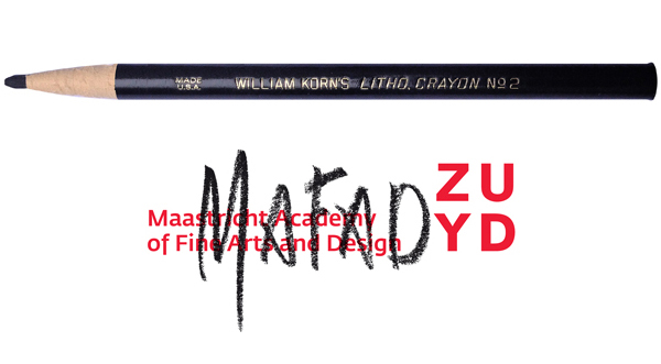 MAFAD, the abbreviation of the Maastricht Academy of Fine Arts and Design, is in the new identity written in lithographic pencil over the established ZUYD University corporate logo. Handwriting and concept are by graphic designer/ art director Boy Bastiaens who was asked end of 2014 by MAFAD’s dean, Chequita Nahar, to take care of a new creative direction in visual communication.
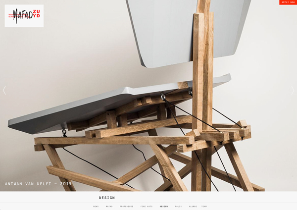 ”It was a unique opportunity to stay away from the standard logo-redesign procedure as the approach fits perfectly to the character of an art institute.” says Bastiaens. The visual identity is simple, works in a straightforward way and fully embodies the school’s progressive mission. Evidently shown in the website design which juxtaposes the individual artistic talents by emphasizing on the quality of the work.
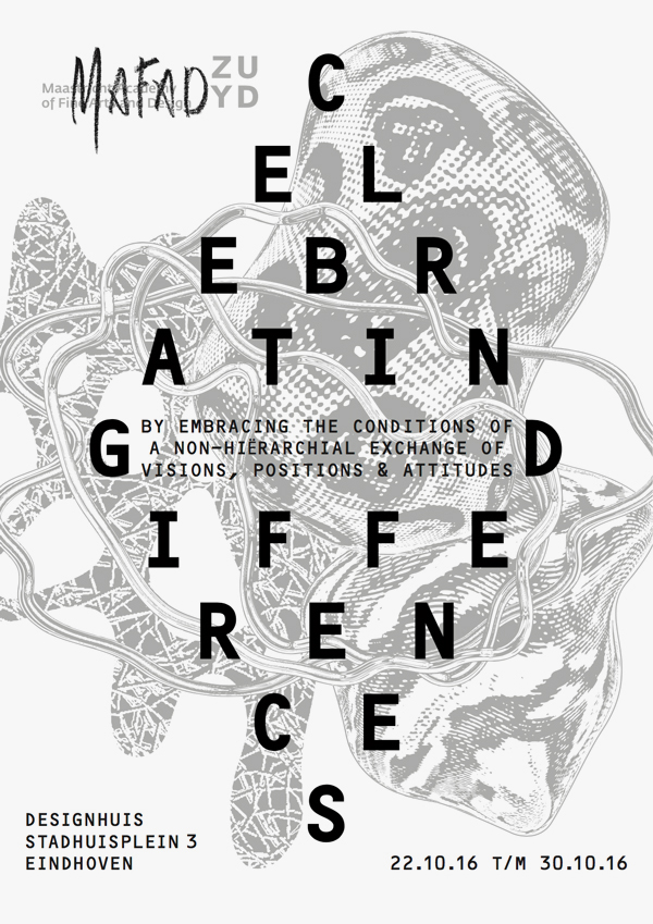 The main typeface employed in the MAFAD house style is the OCR-B, designed in 1968 by Adrian Frutiger. The poster/leaflet that is promoting the CELEBRATING DIFFERENCES Expo during the 2016 Eindhoven Dutch Design Week, reveals a customized bold OCR-B for the title. Pointing, in tandem with the illustration of biomorphic shapes, to the student’s playing field in which space is given to experiment within the different domains.
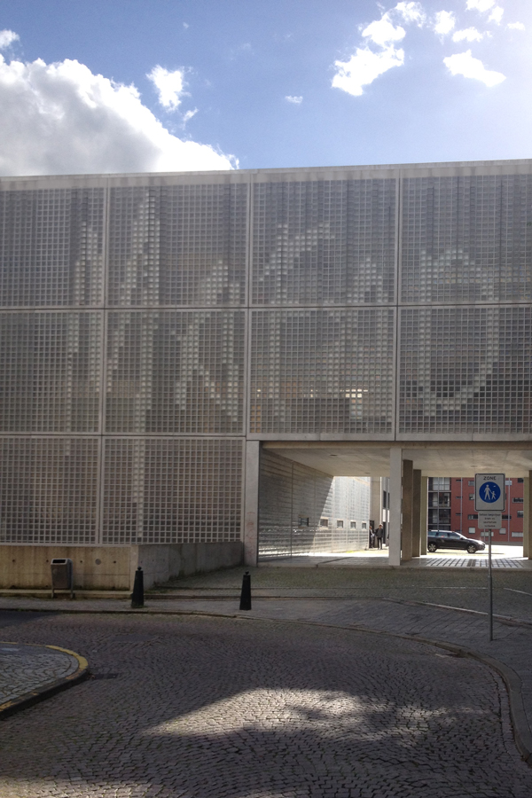 The new visual identity adopts also ideas of making a difference through small interventions with great impact. A good example is the mega MAFAD handwriting signage displayed on the glass facade of the 4 floor academy building during the midsummer class of 2016 graduation expo. Bold enough to stand out and helping the spot get noticed by visitors.
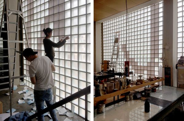 The operation involved 800 white adhesive stickers which were manually attached onto the glass bricks inside the building by students using the architectural window pattern as grid next to a detailed technical drawing for figuring out what to do. After the expo the unique identifier, extended to the size of the building, remained a little longer on the spot as a result of the many positive reactions received from staff, students, visitors and passersby.
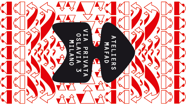 A couple of months earlier, on the occasion of the 55th edition of the annual edition of Salone del Mobile in Milano, Italy, the Dutch academy presented themselves as ATELIERS MAFAD. Giving insight in the process of making and emphasizing on the new design study profiles: Body, Object and Material. For this presentation a new sub-logo was designed in the shape of an arrow featuring the OCR-B typeface as well.
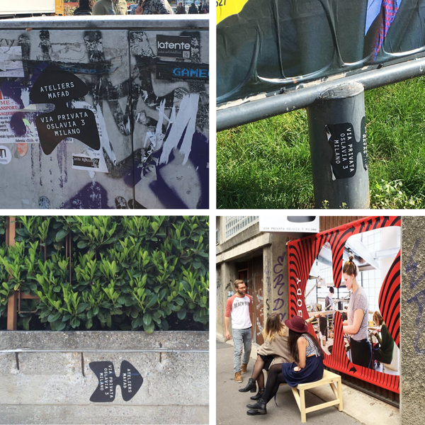 Next to applications on traditional and site specific carriers like info panels, banners, a.o. the arrow logo was also used as a very simple way-finding sticker. Directing visitors in heavily crowded Milano to the Ventura curated exhibition area which displayed ATELIERS MAFAD workshops of three masters connected to the Academy who each invited promising students and alumni.
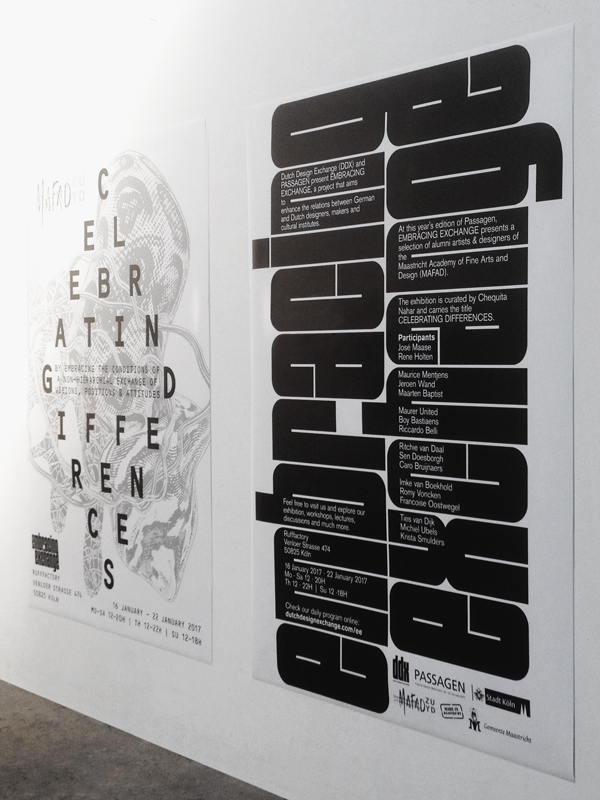 Poster design for the DDX (Dutch Design Exchange) - which displays the DDX logotype's font - on the ocassion of their Embracing Exchange project. Presented during the 2017 Passagen Interior Design Week Cologne, Germany by means of a new MAFAD Celebrating Differences exhibition. Curated by MAFAD dean Chequita Nahar, the show featured a selection of (alumni) artists and designers related to the academy.
MAFAD website technical implementation by Vagebond


