Boy Bastiaens
muziekgieterij  identity
‘De Muziekgieterij’ (The Music Foundry) is a music venue in the heart of the former historical industrial area of Maastricht, The Netherlands. Originally started as an initiative of a group of music enthusiasts, within 10 years 'De Muziekgieterij' has become an internationally revered music venue. Highly appreciated by both musicians and music industry professionals for the excellent facilities and typical 'Limburg' hospitality. But also not in the least because of the location in an early industrial factory building. Giving the venue a unique atmosphere, with high end equipment and facilities housed in a building from a previous age.
In April 2015 Boy Bastiaens was appointed to design a new identity for the Muziekgieterij. Including a new instantly recognizable and memorable logo. Bastiaens took the music venue’s name as a starting point, by investigating visual translations of both words ‘muziek’ (music) and ‘gieterij’ (foundry.
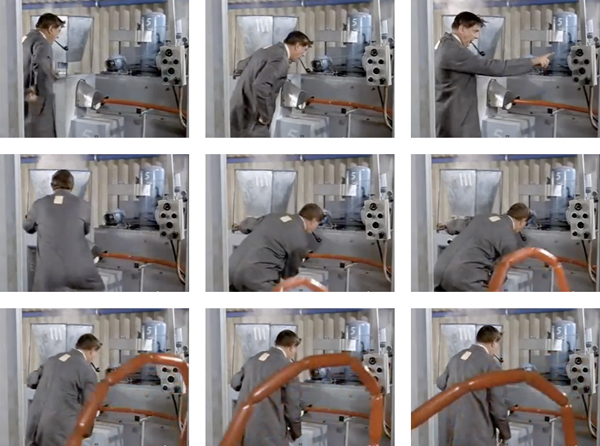
Inspiration for the shape of the word ‘foundry’ came from Jacques Tati’s movie 'Mon Oncle'. More particularly the 'Plastac factory sequence', where monsieur Hulot struggles with the unstoppable plastic tube production process. A reflection of which can be found in the perspective of the logo's bold curved line on the left
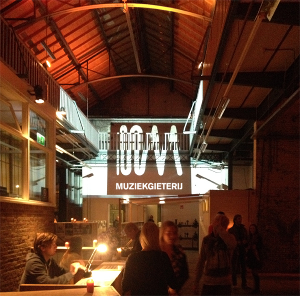
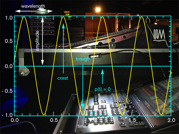
The ‘music’ part of the logo was inspired by the shapes of high frequency sound waves. The logo‘s endresult is a single line abstract symbol which is not only a hieroglyphic explanation of the name but also can perceived as an ’M’ monogram. Standing for the abbreviation of the name Muziekgieterij as well as its location, Maastricht
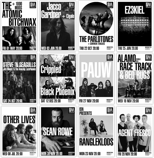
The new concept is based upon a simple grid; using the Helvetica Ultra Compressed for all typography in a black & white layout. Which gives all venue posters a generic instantly recognizable look. And at the same time leaves enough room for the artist's branding from the press photo's provided by the musician's agents or managements.
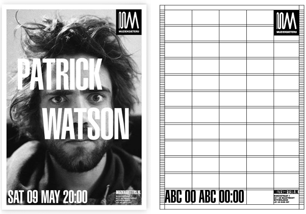
The first 25 posters were designed by Boy Bastiaens to explore image and type in terms of variation, readability and consistency. The basic-layout was outlined in a manual which allows the Muziekgieterij to fill in the posters themselves with texts and photo’s.
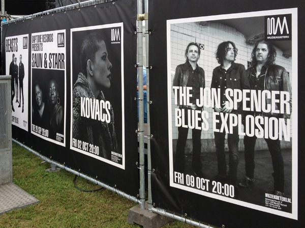
A handbook which makes it possible that new in-house made posters can be put together quickly, logical and aesthetically pleasing in a recognizable style. Grabbing the viewer's attention to the event in seconds, and at the same time clearly linking the message to the sender.