Boy Bastiaens
k karl lagerfeld  brand identity
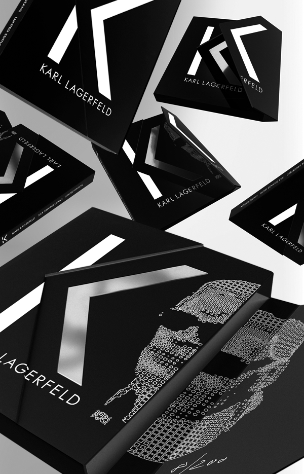
A selection of two- and three dimensional graphic elements, designed by Boy Bastiaens for K, the label of Karl Lagerfeld. Developed with close attention to detail and innovative usage of material.
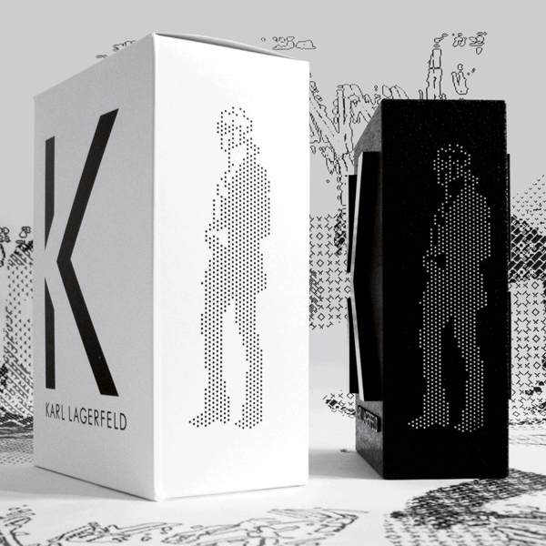
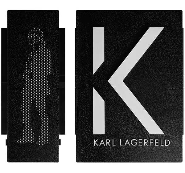
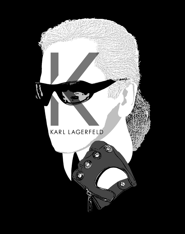
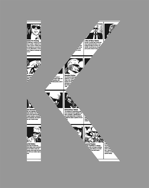
Featuring the pixeled portrait pictogram of the fashion designer and its application as a sublogo on the injection moulded polyurethane, in-store sign & packaging. 2007
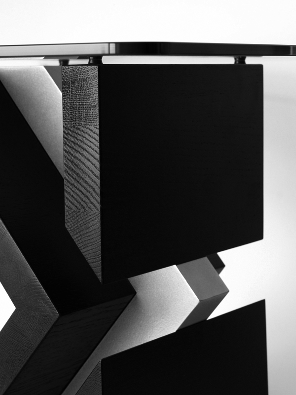
The 'K' logo shape accessories table that makes an imaginative use of black stained massive oak, aluminium and crystal glass.
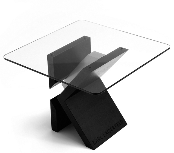
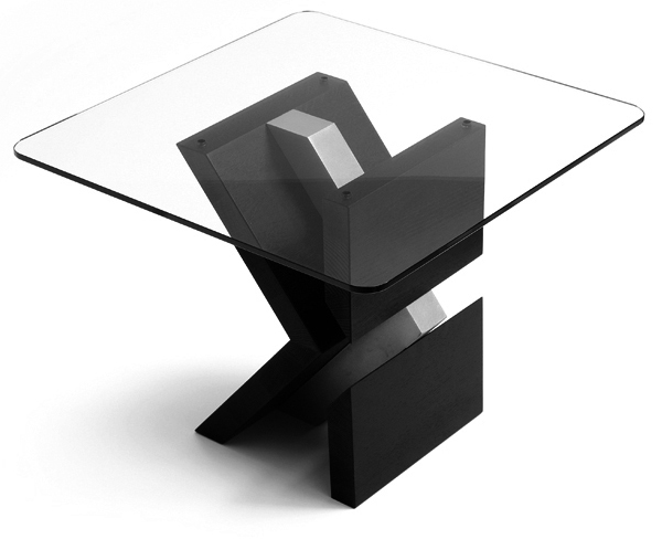 While asymmetry, form simplicity and elementary construction details give the object its distinguishing characteristics. Produced in a edition of 107 pieces. Developed to use also, without glass top, as a spatial logo signage. 2008 (photos: Kim Zwarts)
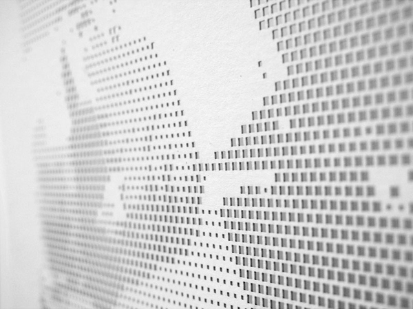
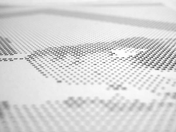
Up close, the laser cutted season greetings card looks like a grid build up by little squares in 3 different weights that have been cut out.
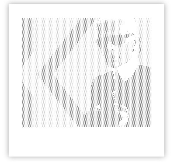 While from a distance the image appears of the fashion designer standing in front of the K logo, 2007
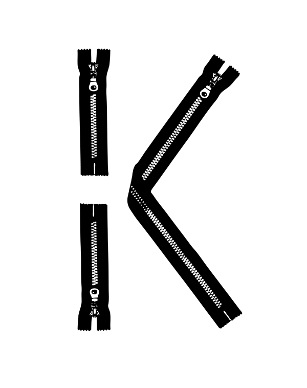
T-shirt prints and proposals that use the K logo as key element and run the gamut from minimalist to witty.
Designed for the garment that ever since the 70's has flourished as a personal expression medium.
Allowing people to flaunt their taste for for rock bands, pop culture items or favourite designer brands.
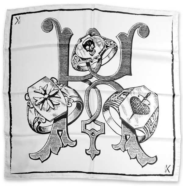
Victorian variant of the ‘K’ logo used for a silk scarf print and t-shirt print amongst other applications, 2009
Limited edition packaging. Black bookbinders linen slipcase with an asymmetric envelop lid that uses the K logo as an inventive closing mechanism. Squares based Karl Lagerfeld image silkscreened on two different height levels, 2009 ( prototype / not executed )