Boy Bastiaens
logo's & trademarks  various clients
 As a graphic symbol of a company or service, a logo is visual communication at its most basic - the purest form of graphic design. Being the primary identifier, it is the single most important element in a identity program.
![]() Logo symbol for the young and award winning Mourmans Nypels Architecture And Design whose view is a process of finding and to be found, balancing between active and focused search and leave things to its coincidence. 2020
Logo symbol for the young and award winning Mourmans Nypels Architecture And Design whose view is a process of finding and to be found, balancing between active and focused search and leave things to its coincidence. 2020
![]() The Roman Quarter logo for the city of Heerlen refers to the town’s heritage of being the oldest Dutch Roman settlement at the crossroads of two major Roman roadways. If you take a close look to the symbol you can see a big square crossed by 2 stripes referring to the two ancient crossroads. The symbol also can be perceived as a top view of a Roman column on a tile floor. 2020
The Roman Quarter logo for the city of Heerlen refers to the town’s heritage of being the oldest Dutch Roman settlement at the crossroads of two major Roman roadways. If you take a close look to the symbol you can see a big square crossed by 2 stripes referring to the two ancient crossroads. The symbol also can be perceived as a top view of a Roman column on a tile floor. 2020
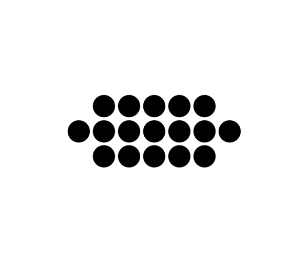
The symbol for the Black X Brew Coffeehouse formulates playfully messages. For example what at first glance seems to be a random arrangement of coffee cups turns upon closer inspection into a dotted X. 2019
![]() The logo for the Maastricht Photo Festival shows an eye looking through a star. Which is as close as it gets to both the photo manifestation as well as the official symbol for the city of Maastricht which has been using the star as heraldic emblem on their coins since 1607. 2018
The logo for the Maastricht Photo Festival shows an eye looking through a star. Which is as close as it gets to both the photo manifestation as well as the official symbol for the city of Maastricht which has been using the star as heraldic emblem on their coins since 1607. 2018
![]() Logo for the SHINE exhibition which questions how ‘contemporary jewellery’ relates to other professions within the creative industry, like architecture, urban-, product-, media- and fashion design. 2018
Logo for the SHINE exhibition which questions how ‘contemporary jewellery’ relates to other professions within the creative industry, like architecture, urban-, product-, media- and fashion design. 2018
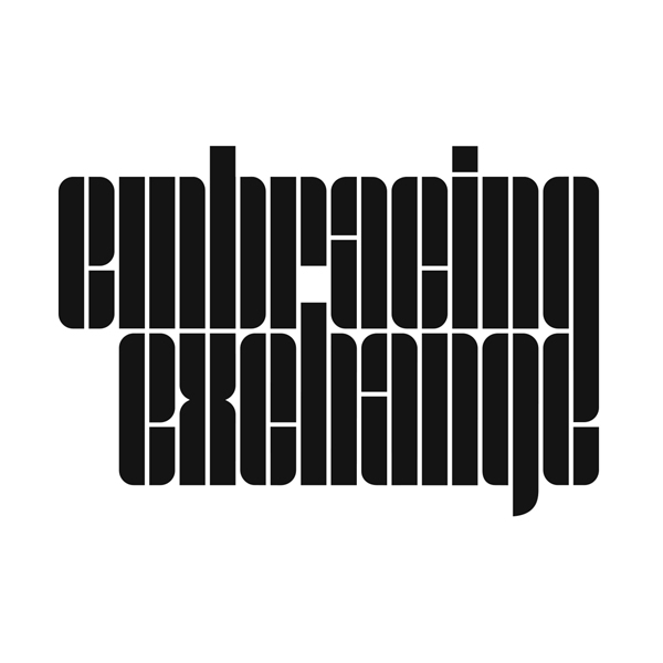 embracing exchange is the name of the multi-annual traveling design exhibition which showcases the best of contemporary author design of the hotspot triangle: Eindhoven (NL), Cologne (DE) and Maastricht (NL). 2017
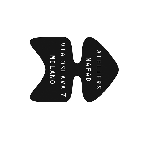 Ateliers Mafad - During the 55th edition of the Salone del Mobile di Milano in Italy, the Maastricht Academy of Fine Arts and Design presented themselves as Ateliers Mafad. 2016
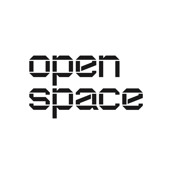 Open Space is an art gallery annex multifunctional spatial area annex library in main building of the Kunstacademie Maastricht. The logotype draws inspiration from space craft industry as well as early Bart van der Leck stencil letters. 2016
.jpg) Co Creation Lab - The hidden word in the logo for the Brightlands’ Greenport Campus laboratory for education, research & development of new food concepts reveals in a vivid way what this place is all about. 2015
Co Creation Lab - The hidden word in the logo for the Brightlands’ Greenport Campus laboratory for education, research & development of new food concepts reveals in a vivid way what this place is all about. 2015
 HAIKU is a Japanese poetry style based upon three phrases of respectively 5, 7, and 5 words. Its visual structure was captured in a graphic symbol and used for the 2015 MAFAD (Maastricht Academy of Fine Arts and Design) Haiku theme based graduation publication. 2015
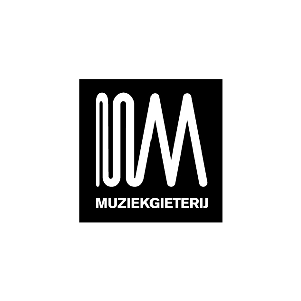 The logo for the Muziekgieterij (Music Foundry) venue is a visual translation of the words ‘muziek’ (music) and ‘gieterij’ (foundry) into a single line abstract symbol. Which draws inspiration from Jacques Tati's 'PLASTAC sequence' (Mon Oncle) as well as the shape of soundwaves. 2015
![]() Jettson footwear is all about minimalist design, enhanced when it comes to materials and finished off with a hint of sportswear functionality. Made and assembled in Europe in limited quantities. 2015
Jettson footwear is all about minimalist design, enhanced when it comes to materials and finished off with a hint of sportswear functionality. Made and assembled in Europe in limited quantities. 2015
![]()
Maurer United Architects - A bold minimalist letter 'M' build up by 3 piles of bricks in a visual link to the German translation of the name 'Maurer' which means 'bricklayer' or 'mason’. Read more about the symbol here. 2015
![]()
DDX (Dutch Design Exchange) was set up in order to help Dutch businesses within the creative industry (design, fashion, architecture, new media, etc.) to to enlarge their market beyond the national borders. 2014
![]()
De Wouwse Plantage - A symbol that is both a pine cone and a heraldic crest, designed for Finvest Holding who has great plans with the estate of the Wouwse Plantage forest near Roozendaal, The Netherlands. 2014
![]()
Iimono - The Japanese word iimono means ‘good things’. This emblem for a webshop was created by rotating the ‘ii’’s five times. The result resembles a Kamon: the traditional Japanese heraldic crest. 2013
Symbol for the fashion business and management consultancy Silhouette Of Chalk, established by G-Star co-founder Marc Bertens. 2013
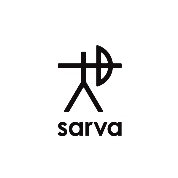
The Sarva archer symbol is inspired by an ancient Sami sign which refers to the background of the founding members of the outdoor brand. 2014
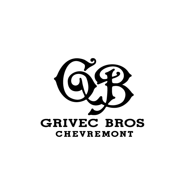
Grivec Bros. - Wordmark for the, Chevremont based, small-scale denim brand of the Grivec twin brothers. Wherein the ornate Victorian "G" and "B" display letters ‘holding hands’ and turn the monogram into one single entity. 2013
![]()
Hidden - A spatial striped letter H as the graphic icon for a small scale, yet luxurious wellness hotel designed by Maurice Mentjens which will open doors in the historical centre of Maastricht. 2012
![]()
Taskers - An abstract 't'- shape, single-letter mark for Taskers: the workforce solutions enterprise in permanent, temporary and contract recruitment. Naming & design. 2011
![]()
Von Eusersdorff - Perfume formulations from a family tradition of artisans. The design for the Von Eusersdorff label brings back the flower as the traditional ornament for fragrances. 2010![]() Friends Simon Stevin Institute. Foundation for ensuring the independency of the institute in conducting research on natural shapes and on supporting education in geometry. 2008
Friends Simon Stevin Institute. Foundation for ensuring the independency of the institute in conducting research on natural shapes and on supporting education in geometry. 2008
![]() K Karl Lagerfeld - Pixelportrait of the fashion designer. Designed as sub-logo for product graphic usage, interior- and signage purposes as part of the positioning of the Karl Lagerfeld K brand, 2006
K Karl Lagerfeld - Pixelportrait of the fashion designer. Designed as sub-logo for product graphic usage, interior- and signage purposes as part of the positioning of the Karl Lagerfeld K brand, 2006
![]() Conflict - The icon for Conflict, designmarket, is a castle in the air surrounded by dark clouds. An ominous atmosphere that visually embraces the heraldic device that stands for tradition and residence, 2005
Conflict - The icon for Conflict, designmarket, is a castle in the air surrounded by dark clouds. An ominous atmosphere that visually embraces the heraldic device that stands for tradition and residence, 2005
![]() Nippon Denim - 29' Selvage Shuttle Loom Nippon Denim is the name of a rare upper level denim quality with the surplus of a distinctive white thread. Exclusively introduced to the European market by Red+, 2004
Nippon Denim - 29' Selvage Shuttle Loom Nippon Denim is the name of a rare upper level denim quality with the surplus of a distinctive white thread. Exclusively introduced to the European market by Red+, 2004
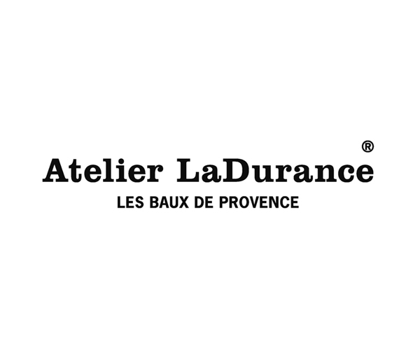 Atelier LaDurance - Timeless and eloquent wordmark design for a French exclusive denim label. Key element within the brand's comprehensive brand identity program, 2002
![]()
Atelier LaDurance - The Fleur-de-Lys symbol was introduced by the French monarchy in the 12th. century. A stylized version of the heraldic emblem was used for the Atelier LaDurance knitwear range. 2005.
![]()
Atelier LaDurance - The Camargue Cross features a cross (faith), anchor (hope) and heart (charity). The stylized design of the ancient French symbol is used as a sublogo for the tricots & jerseys of the label’s range. 2005
![]() Red+ - Playful identity. Logotype with an emphasis on the merged and 45° rotated 'D' and '+' characters transforming into a pictogram of a stylized devil and adding an extra value to the word 'RED', 2003
Red+ - Playful identity. Logotype with an emphasis on the merged and 45° rotated 'D' and '+' characters transforming into a pictogram of a stylized devil and adding an extra value to the word 'RED', 2003
.![]() 14 oz - Naming & design. 'Fourteen Ounce' is the exclusive store of Karl Heinz Müller, managing director of B&B, that previously used to be located in Cologne and re-opened the doors in 2008 in Berlin,1999
14 oz - Naming & design. 'Fourteen Ounce' is the exclusive store of Karl Heinz Müller, managing director of B&B, that previously used to be located in Cologne and re-opened the doors in 2008 in Berlin,1999
![]() Australian Homemade - With an open brief from the client and only the name set, Boy Bastiaens conceived the complete design blueprint for Australian Homemade: from logo - to packaging - to interiorconcept, 1995
Australian Homemade - With an open brief from the client and only the name set, Boy Bastiaens conceived the complete design blueprint for Australian Homemade: from logo - to packaging - to interiorconcept, 1995
![]() Language And Technology 2000 - Logo designed for a serie posters designed together with Albert Kiefer for the European Commission DGXIII, Language and Technology 2000 exhibition, 1993
Language And Technology 2000 - Logo designed for a serie posters designed together with Albert Kiefer for the European Commission DGXIII, Language and Technology 2000 exhibition, 1993
![]() StormHand - The dadaist approach of merging two at random chosen words into a nonsensical name, was the kick-off to use StormHand as title for all collaborative projects by Boy Bastiaens and Albert Kiefer, 1993
StormHand - The dadaist approach of merging two at random chosen words into a nonsensical name, was the kick-off to use StormHand as title for all collaborative projects by Boy Bastiaens and Albert Kiefer, 1993
 Personal Logo (1994-2000) A section of four arrows found in a old Letraset catalog, revealed in its negative space the stylized corps of a human silhouette. By adding a white circle for the head the symbol was enclosed by a bold oval. The symbol was used in the 90's as personal logo. 1994
Some of the logo's of this section and some other logo's by Boy Bastiaens were selected to contribute in:
Letters as Symbols, Christophe de Pelsemaker & Paul Ibou, Belgium
Art Marks, Counter Print, United Kingdom, 2016
Abstract Logo, Counter Print, United Kingdom, 2016
SYMBOL Mini, Laurence King Publishing, United Kingdom, 2016
LOGOTYPE Mini, Laurence King Publishing, 2016
Nature Logo, Counter Print, United Kingdom, 2015
Modern Heraldry, Counter Print, United Kingdom, 2015
Alphabet Logo, Counter Print, United Kingdom, 2015
LOGO Mini, Laurence King Publishing, 2015
Human Logo, Counter Print, United Kingdom, 2014
Monogram Logo, Counter Print, United Kingdom, 2014
Logo Talks 2, Artpower Publishing, Hong Kong, 2013
LOGOTYPE, Laurence King Publishers, United Kingdom, 2012
SYMBOL, Laurence King Publishing, United Kingdom, 2011
Basic Logo’s, Index Books, Spain 2009
No Rules Logos, Rockport, USA, 2009
Squares, Checks And Grids, RotoVision, Switzerland, 2007
LOGO, Laurence King Publishers, United Kingdom, 2007
Pictogram and Icon Graphics, Pie Books, Japan, 2002
Logo World, Pie Books, Japan, 2002
New Logo and Trademark Design, Pie Books, Japan, 1998


