Boy Bastiaens
conflict  shop identity
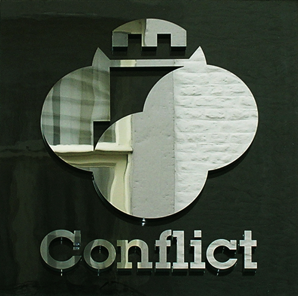
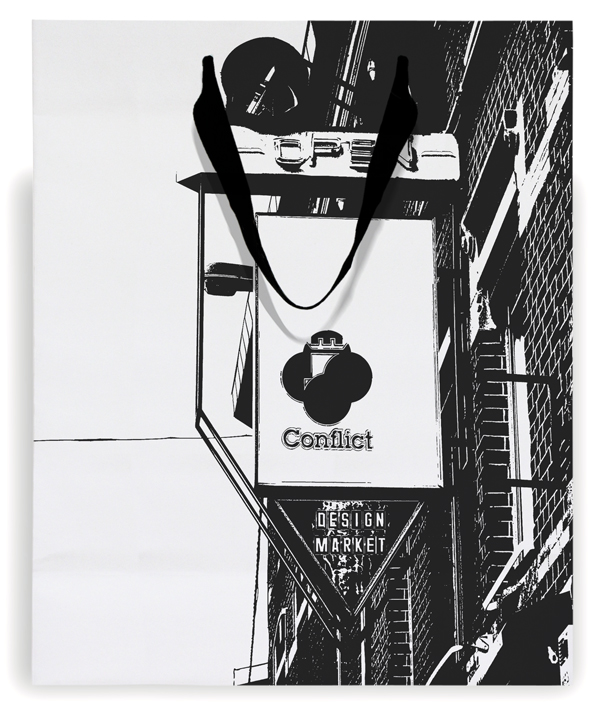
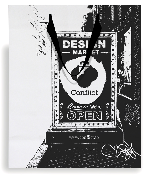
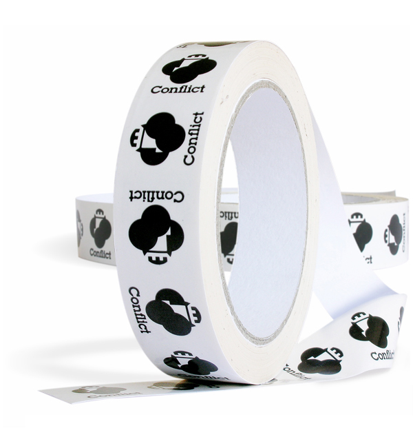
Conflict is a store that brings contemporary furniture, home accessories and gifts together in a collection with a strong focus on Dutch Design. The logo of the store shows a castle in the air surrounded by dark clouds. An ominous atmosphere that visually embraces the heraldic device that stands for tradition and residence.
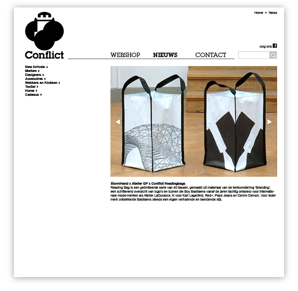
Boy Bastiaens designed the store’s bold graphic identity in 2005, featuring earlier rejected signage proposals that found their new destination as illustrations on shoppingbags.
Stationary items and website featuring invites with interior and exterior photographs by Kim Zwarts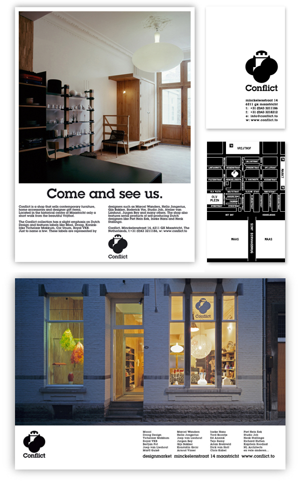
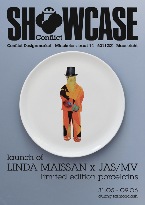
 Invites for Conflict’s temporary gallery ‘Showcase’ which uses, since 2012, twice a year the shop window to exhibit very special design-projects and unique collaborations..
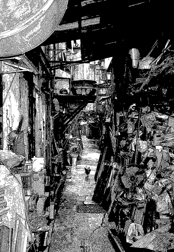
Graphic designs that put things in the right perspective. Like the Conflict gift voucher with on its backside an image of an alley crammed with out-of-order goods and dumped mess.
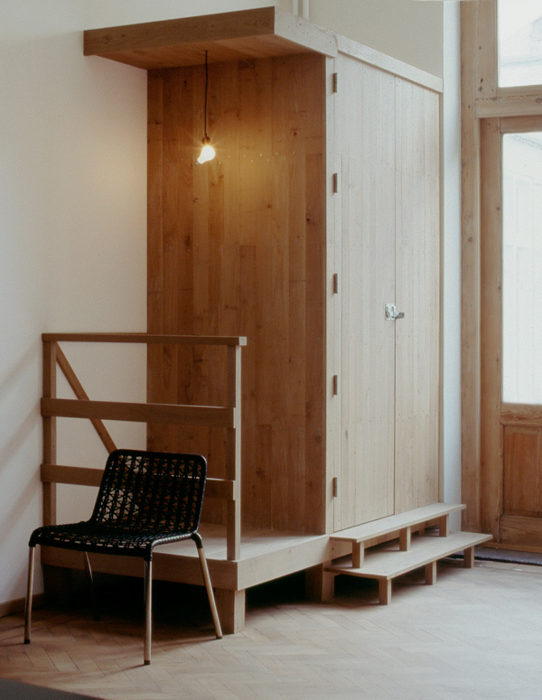
Out of the realm of graphic design Boy Bastiaens came also up with some pragmatic ideas on Conflict’s interior concepting. Like for example the toilet, a wooden cabin unit, that's bluntly situated in the corner of the store.
However the single item that sticks al different components together and makes the brand alchemy work is the logo. Bold in its graphic presentation and narrative in expressing the inexpressible.
 A range of Conflict’s shop identity elements were selected to contribute in:
Branding and Identity, Artpower International Publishing Co, Hong Kong, 2015
Nature Logo, Counter Print, United Kingdom, 2015
Symbol mini, Laurence King Publishers, United Kingdom, 2015
LOGO Mini, Laurence King Publishing, 2015
Symbol, Laurence King Publishers, United Kingdom, 2011
Package 01, Choi's Gallery, China, 2010
The Big Book Of Bags, Labels And Tags, Harper Collins, USA, 2009
1000 Package Designs, Ginko Press, USA, 2009
LOGO, Laurence King Publishers, United Kingdom, 2007
Real Dutch Design, Bis Publishers, the Netherlands 2007


