Boy Bastiaens
australian homemade  brand identity
Between 1995 and 1997 Boy Bastiaens created the comprehensive Australian Homemade brand identity: from logo - to packaging - to interior design concept. Commissioned by Dutch commercial entrepreneur Rini Korst who planned the set up of a number of shops based around ice cream products and chocolates. Following the ‘profits with principles’ business philosophy by supporting Aboriginal projects with a part of the turnover. Korst had the recipe licence, from a Belgian ice cream maker, who learned the ice cream making trade from his aunt in the outback of Australia in 1972 - as the story went.
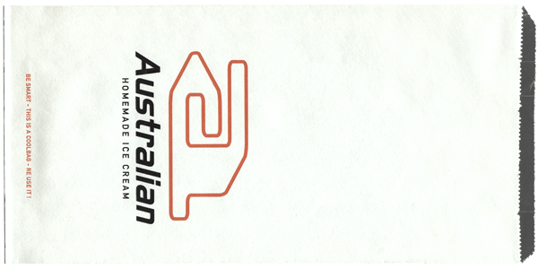
With only the name Australian Homemade set and a blank canvas, the project kicked off with the design of the logo. As a symbol of a company, a logo is visual communication at its most basic and the single most important element within a brand identity, 1995.
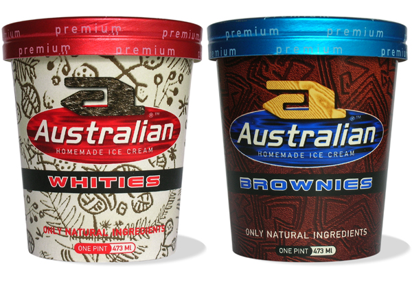
In the design of the 6 ice cups all the generic food imagery of ingredients (nuts, chocolate, fruit, cream e.g.) and Australia clichés. (kangaroos and boomerangs) were left out. Inspired by the amazing visual language of early Aboriginal stone carvings, motifs were designed to distinguish the variety in available tastes, 1995.
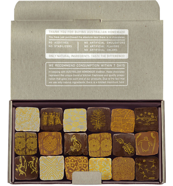
 Greyboard is made from waste paper. It feels recycled, it is strong, flexible and cheap. It is also the material of the exclusive Australian Homemade chocolate packaging. A wide variety of motifs, indicating different tastes, were printed with carotene on square shaped chocolates and the jewel like pieces established a strong contrast between content and packaging, 1997

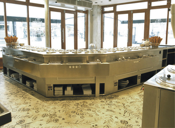
Confectionery and ice cream manufacturing used to be traditional trades with their own standard vocabulary of design standards. Australian’s fresh approach was not restricted to packaging only but covered also, as early Dutch ‘brand experience’ project, for Boy Bastiaens the interior design concepting of the stores, 1996.
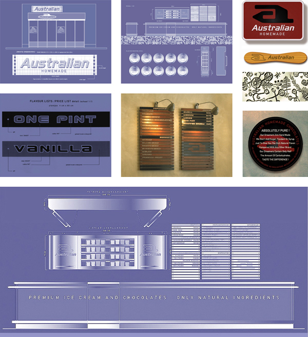
Build up with a material palette of stainless steel, glass, concrete and natural wood, the Australian Homemade interior concept combines an eclectic mix of different styles in a harmonious way. Featuring a ground breaking detail, that went against all rules of the traditional ice cream salon. A counter that did not show ice cream at all !
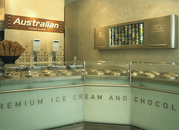
Both basic counter design and ‘hidden’ ice cream section underneath stainless steel cupboards, must be credited to Dutch architect Wouter van der Schans. Who was involved in the project for the technical implementations. The later version redesigned for the franchise market also captured the original ‘hidden ice cream’ section.